z

Young Writers Society


Picture of my "Last Sentinel" in my story


User avatar
672 Reviews


Gender: Male
Points: 5577
Reviews: 672
Mon Feb 05, 2007 12:22 pm
Squall says...


Hey ya guys ^^ For all those who have read my fantasy story, Angelsea I: The Last Sentinel, you would know about one of the two currently introduced characters.

This is a pic of Cleo, the Last Sentinel. I decided to take an anime/ cute approach to my story to make it more fresh and unique as a fantasy story rather than being all serious and depressing.

Image

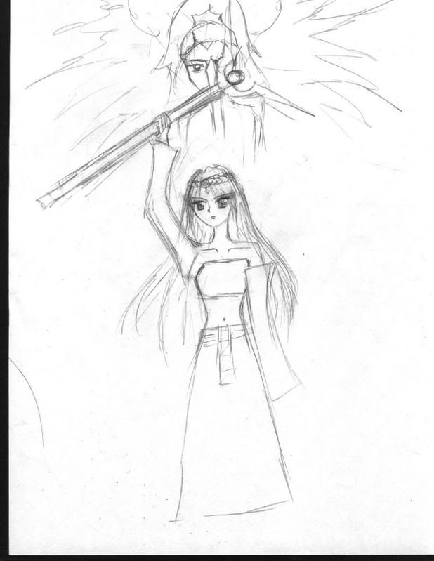
Hope you think she's cute ^^

I'll host more pics for my story. Bye for now
Last edited by Squall on Thu Feb 21, 2008 7:29 am, edited 1 time in total.
"To the edge of the universe and back. Endure and survive."


User avatar
657 Reviews


Gender: Female
Points: 6523
Reviews: 657
Mon Feb 05, 2007 7:01 pm
Jennafina says...


I like her! She looks kind of like a CLAMP character.

She's much too short, though, and her plain dress looks weird with her highly detailed face, hair and staff. I'd give the dress some wrinkles and shading, then go over the entire thing in pen.

Nice work!
Jennafina's Love Your Body Already Dammit Campaign

forum353.html

(To find out what it really is, just click.)


User avatar
245 Reviews


Gender: Other
Points: 2570
Reviews: 245
Mon Feb 05, 2007 7:25 pm
LowKey says...


Hey! It looks great! Indeed, she does look VERY cute. Her arm that has the staff, however, looks disconnected from the rest of the body. :shock:
Other than that, I think it looks great! I love it. I agree with Jennafina on the dress. It looks awesome, but some shading couldn't hurt. Once again, I think she looks great! Keep up the good work! :D
Necropolis SB / Necropolis DT

Once was Dreamer, is now LowKey_Lyesmith.

Everybody is a genius. But if you judge a fish by its ability to climb a tree, it will live its whole life believing that it is stupid.


User avatar
116 Reviews


Gender: Female
Points: 890
Reviews: 116
Tue Feb 06, 2007 8:12 pm
Lilyy03 says...


Wow, she is very cute. ^_^ Her hand looks a bit odd though.


User avatar
253 Reviews


Gender: Female
Points: 890
Reviews: 253
Tue Feb 06, 2007 9:52 pm
CK Lynn says...


I liked her, but the arm that wasn't holding the staff looked so unnatural. Try to make it belong in the picture.


User avatar
647 Reviews


Gender: Male
Points: 9022
Reviews: 647
Fri Feb 09, 2007 7:17 am
Alteran says...


I think if you conform the sleeve to a more arm like shape it will give it the belonging look. :)
"Maybe Senpai ate Yuka-tan's last bon-bon?"
----Stupei, Ace Defective


User avatar
368 Reviews


Gender: Female
Points: 1125
Reviews: 368
Fri Feb 09, 2007 9:51 am
Shine says...


yeah she is cute.

but something is wrong with the dress.
"A good plot is like a dream.If you dont write down your dream on paper the moment you wake up,the chances are you'll forget it and it'll be gone forever"-Roald Dalh.


User avatar
820 Reviews


Gender: Female
Points: 890
Reviews: 820
Fri Feb 09, 2007 10:19 am
Myth says...


I love her hair and the staff(?) in her hand. But what is that face in the sky?
.: ₪ :.

'...'


User avatar
12 Reviews


Gender: Female
Points: 890
Reviews: 12
Mon Jan 14, 2008 6:40 pm
ElizaW says...


First off, I like the way you've draped her hair over her shoulders, and given the anime-esc style her eyes look very nice.

Her right shoulder, since the arm is raised, should also be higher than the left shoulder: you can't raise your arm like that without raising the clavicle. Likewise, her neck is too thin and too straight, and I think it needs to extend further to (our left) her right. The right wrist seems to be bent to the side, which doesn't look natural. It would look better bent to wards her instead, possibly not holding that rod quite so vertically.

Proportionally her skirt is also much too short... take about half of its length and add it on again to the bottom, so that I'm not picturing legs even shorter than her arms. I also wish you'd put more detail into her clothing.

You do, however, manage to get a general feel of the character down, which is nice. and the rod's effect is interesting. Thanks for sharing.
The first million words you write are for practice. It doesn't count. Practice getting rejection letters. Don't worry. It doesn't count. If someone accepts your practice novel, it doesn't count either. Practice cashing that check. (-David Gerrold)


User avatar
441 Reviews


Gender: Female
Points: 890
Reviews: 441
Mon Jan 14, 2008 10:42 pm
Gwenevire says...


I think I like the head at the top better.
Its cool.
Maybe a bit of colour and some more detail then you will have some art :)


User avatar
683 Reviews


Gender: Female
Points: 890
Reviews: 683
Sat Jan 19, 2008 11:19 pm
Emma says...


Why is her collarbone sticking out so much? Why does every hero, or main character have to be skinny and beautiful? God damnitttt. Give us some "unattractive" and slightly overweight main character! Right, I'm going to do that. Sorry I don't mean to be so mean, I think your picture is lovely, I'm just having an Emma moment and seem to be taking it out on you. Sorry. (:


User avatar
522 Reviews


Gender: Female
Points: 7715
Reviews: 522
Sat Feb 16, 2008 5:15 pm
canislupis says...


ooh! I really like her face and hair, It's really cool. ^__^ The right arm looks a bit out of place, and now that I'm thinking about it, so does the other one. And why is her armpit so fat?

I think if you added more detail to her body and surroundings, it would look better. The face and head are perfect.

See ya around!

~lupis


User avatar
602 Reviews


Gender: Female
Points: 1609
Reviews: 602
Wed Feb 20, 2008 1:48 am
Wolf says...


Hey, I didn't know you could draw!

This is pretty good, actually. I love the staff, and she is very cute, in an anime-ish kinda way. These are the things that bothered me:

- The arm holding the staff looks kind of fat near the arm-pit, as lupis said. You might want to shave off a bit there. XD
- Her eyebrows look a bit too long, almost as if they wrap around the sides of her head. You might want to shorten them a bit, but it could just be me.
- As Jenna mentioned, you should add more detail to her dress. It looks weird because her face is so detailed and then her dress is really simple and 2-D looking.

And maybe you could make her hair look thicker (add more strands) on the left side? It's nice and voluminous on the right, and the left... not so much.

But overall, neat drawing! Very cool, especially the face in the sky. :D

Keep it up!

- Camille
everything i loved
became everything i lost.


Would you like a review?
http://www.youngwriterssociety.com/topic73903.html


User avatar
721 Reviews


Gender: Female
Points: 7241
Reviews: 721
Wed Feb 20, 2008 2:31 pm
Azila says...


The face is really cute. The eyes are perfect--very anime. The hair is also really good, although I think it could use to be thickened up towards her neck. If you make the hair on ether side of her neck darker, it will make the whiteness of her skin pop out more. :wink:

Like everyone else said, you should add more detail on her whole outfit. Some shading would be nice, ya?

Also like everyone else said, those sleeves are a little odd. :? Maybe try making them more tight-fitting? Also, she's missing a hand. :wink:

I think you should add her ankles and feet on, too. Otherwise it looks like she has really short legs. XD What kind of shoes will she be wearing??

Conclusion: I can tell that you spent a lot of time on the face--and it's very good. Now, you just need to give some more time to the rest of her. This piece looks unfinished.

Hope this helps!
~Azila~


User avatar
370 Reviews


Gender: Male
Points: 890
Reviews: 370
Wed Feb 20, 2008 6:28 pm
Aedomir says...


I think she's really cool and cute! Well done, better than I could ever do!

Keep Drawing!

~D'Aedomir~
We are all Sociopaths: The Prologue

Sociopath: So • ci • o • path noun
1. Someone who believes their behaviour is right.
2. Human.


cron
Teach a man to fish, he eats for a day. Don't teach a man to fish, you eat for a day. He's a grown man. Fishing's not that hard.
— Ron Swanson (Parks and Rec)