z

Young Writers Society


RPG Art


User avatar
104 Reviews

Supporter


Gender: Male
Points: 25731
Reviews: 104
Fri Jun 13, 2014 4:34 pm
View Likes
JayeCShore says...


The description says it all, but I'll say it again. I'm making an RPG (Role Playing Game) Card Game. It's going to be similar to games such as Dungeons and Dragons, (go nerds!) But with a few little twists, the main one being that the characters (heroes) will all have their own deck of playing cards.

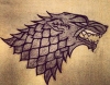
I'm currently working on the card art, which is to say, the backs of the cards and the basics for the fronts. There are going to be cool pictures of creatures or weapons or what not on the fronts, mainly because I don't want to spend all the time drawing and painting. But, yah, I wanted to see if the cards look good before I start making and printing. So here goes :D

Image

Image

Please feel free to comment or leave suggestions. I want it to look clean and professional, so I might be able to market it one day, but I don't want it to be all super fancy and take a bazillion years to make.
If you don't Writer of the Week you don't YWS.

History is like Jello.

I believe in marriage between a man and a woman.


User avatar
289 Reviews

Supporter


Gender: None specified
Points: 30323
Reviews: 289
Fri Jun 13, 2014 5:05 pm
Caesar says...


Sorry, I'm about to completely ignore the art --

is the game a collectible card game like magic/yugioh, or is it a kind of deckbuilding thing a la ascension etc?

--

back to the art I'm assuming that very large blank space will contain the image and flavor text?
vulgus vult decipi, ergo decipiatur


User avatar
104 Reviews

Supporter


Gender: Male
Points: 25731
Reviews: 104
Fri Jun 13, 2014 5:12 pm
JayeCShore says...


It's going to be half a collectible card game. Each player will choose several heroes from several different races (Humans, Elves, Orcs, Undead, etc. etc.) Eeach race has their own decks of Attack, Defense, and Ability cards, and each Hero has their own specialty deck. So, you buy expansions with extra Heroes and extra race cards. But you build your deck just like any other TCG. It's going to be unique.

As for the art, I'm still not sure if I want to add card art or not. I think I might do more of a washout style with the image faded and behind the text. I'll have to add flavor text for sure, otherwise it's just going to be a lot of blank.
If you don't Writer of the Week you don't YWS.

History is like Jello.

I believe in marriage between a man and a woman.


User avatar
1220 Reviews


Gender: None specified
Points: 72525
Reviews: 1220
Fri Jun 13, 2014 7:41 pm
Kale says...


Your description sounds a lot like the LotR TCG, only the LotR TCG has an added element of location cards, which determine things like battlefield advantages, in addition to advancing the story campaign.

Anyways, you'll want to look into a different typeface for the card text, as well as more contrast between the logo text and the card background. Right now, the logo text appears very blurry due to the texturing of the text and the drop shadow, which causes it to blend into the background.
Secretly a Kyllorac, sometimes a Murtle.
There are no chickens in Hyrule.
Princessence: A LMS Project
WRFF | KotGR


User avatar
104 Reviews

Supporter


Gender: Male
Points: 25731
Reviews: 104
Fri Jun 13, 2014 8:17 pm
JayeCShore says...


Here's a modified version of the card back based off of what Kyllorac advised.

Image
If you don't Writer of the Week you don't YWS.

History is like Jello.

I believe in marriage between a man and a woman.


User avatar
289 Reviews

Supporter


Gender: None specified
Points: 30323
Reviews: 289
Fri Jun 13, 2014 8:19 pm
Caesar says...


tbh I dislike the combination of greens, de gustibus though
vulgus vult decipi, ergo decipiatur


User avatar
104 Reviews

Supporter


Gender: Male
Points: 25731
Reviews: 104
Fri Jun 13, 2014 8:29 pm
JayeCShore says...


Okay, here's a plain black one with no drop shadow, so it's not fuzzy.

Image
If you don't Writer of the Week you don't YWS.

History is like Jello.

I believe in marriage between a man and a woman.


User avatar
332 Reviews


Gender: None specified
Points: 10657
Reviews: 332
Fri Jun 13, 2014 10:06 pm
Blackwood says...


Hey there, this looks cool. I do think that the RE, RF on the card just needs to be slightly more defined, as in maybe just give it a very thin black edge so the texture of the font and the texture of the background has something between them.

Not sure how I feel about the font on the main card details. It looks too much like computer variable font. If you are going to print these physically I think you should invest in something nicer.
I suggest going with a serif font, but a more elegant one. You could have a scour through font sites for something that suits you, but some some my favourites are, and are not limited to.
Garamond - quite elegant. A good balance of unique but not too unique.
Trajan Pro - I wouldn't use it for a main body but it's nice for headings. It's an all caps font. (it's also very widely spaced) Also Charlemagne is a similar option.
ParmaPetit-(heavy swinging) - I can't even remember how I got this font but it looks nice.
Palatinto Lineotype - the most plain out of all of these but I mention it because it's what I write all my stories in.

You don't have to use these or even change it at all if you think that's what suit it. Just throwing out some suggestions so you can see what they look like. I just think your current one is far too computer variable and makes it look a little cheap for a printed card.
Hahah....haha.....ahahaha.


User avatar
110 Reviews


Gender: Male
Points: 546
Reviews: 110
Fri Jun 13, 2014 10:27 pm
Zolen says...


"Plain black" version is a heck of a lot better, color variation is nice, but not when it has to do with the icon portion of the logo. Also I feel like you were intending the design to be centered, but to me it does not look it.
Last edited by Zolen on Sat Jun 14, 2014 12:15 am, edited 1 time in total.
Self quoting is the key to sounding wise and all knowing.


User avatar
73 Reviews


Gender: Male
Points: 1442
Reviews: 73
Fri Jun 13, 2014 10:29 pm
Zontafer says...


Off-Topic: You just have to PM me if you get this out!

On-Topic: First of all, I loved the plain black one with no drop shadow the most, since the text was much clearer than the previous one. Also, it looks more organized, if that's one way to say it.

The front and back of the card doesn't quite match together. The back has this old awesome style, but the front has a lighter colour, which doesnt give the same effect.

I don't know if you wanted any feedback on the text and content itself, but I'm just going to tell you that it'd be so awesome if you added some epic text to it. Describing how the attack is, like in many other games. ^^

Summary: In my opinion, the back of the card(last version you posted) looks pretty neat and doesnt need any more work. :D
The front would be nice if you tried to use the same colour as the backside (Might be the text is harder to see, then you should drop it.) that would also be great!

Btw, I'm not any good at all in these art stuff, fyi... c'x

- Zontafer
"If you're going through hell, keep going."
- Winston Churchill


User avatar
104 Reviews

Supporter


Gender: Male
Points: 25731
Reviews: 104
Fri Jun 13, 2014 11:35 pm
View Likes
JayeCShore says...


@Zontafer @Blackwood @Zolen

Thanks for all the feedback, and I agree with pretty much all the issues you guys have brought up.

Blackwood - I agree the font I've chosen does not really fit. I just haven't gone through and found the right one. I know I'm going to use the same font I used for the logo, for the titles. As for the main body text, I'll have to find something a little older looking, but still able to read well.

Zolen - You are so right about the logo not being centered, and I wish I'd seen that before I got all excited and thought it was great. The problem is that the letters are uneven, so I'll have to redesign it. Thanks for pointing that out.

Zontafer - I also agree that the back is a little less grunge looking than the front. The problem is, it's hard to find a texture that's light and plain enough to not get in the way of the text, but also that is still cool looking. If you happen to find any, I'd love a link :D

Thanks again you guys. If this ever goes commercial, you'll be the first to know.
If you don't Writer of the Week you don't YWS.

History is like Jello.

I believe in marriage between a man and a woman.


User avatar
1220 Reviews


Gender: None specified
Points: 72525
Reviews: 1220
Sat Jun 14, 2014 5:28 am
Kale says...


I'd just like to say that Blackwood is spot-on about adding a black outline around the logo text to help offset it a bit better. It wouldn't have to be a wide outline, so long as it's solid.

Also, as far as typefaces go, Sylfaen is one of my all-time favorites, though Nyala, which is derived from Sylfaen, might be a better fit. Licensing would be an issue if you intended to use them in the final product, but they're very nice serif fonts that were designed for multiple applications, so similar typefaces will have the same flexible properties.

Typedia is a helpful site for looking up typefaces, including similar ones.
Secretly a Kyllorac, sometimes a Murtle.
There are no chickens in Hyrule.
Princessence: A LMS Project
WRFF | KotGR


User avatar
433 Reviews


Gender: Male
Points: 13351
Reviews: 433
Sat Jun 14, 2014 8:54 am
TakeThatYouFiend says...


I think the greeny coloured one might be like a special card. Just a thought.
Also in terms of rule systems can I suggest not including so many character types and rules as d & d. I play a frpg where talents define sub character types.
You know that studded leather armour in films? Nobody wore that. I mean, how would metal studs improve leather armour?


User avatar
289 Reviews

Supporter


Gender: None specified
Points: 30323
Reviews: 289
Sat Jun 14, 2014 9:12 am
Caesar says...


d&d depends on the edition I guess, besides, once you get past them it's quite fun. From what I understand (and what's been told to me) the rules here are rather more simple.
vulgus vult decipi, ergo decipiatur


User avatar
433 Reviews


Gender: Male
Points: 13351
Reviews: 433
Sat Jun 14, 2014 12:25 pm
TakeThatYouFiend says...


@Judas were it not for the expense I would probably play d&d but there are simply to many expansions and sub rules etc. As it is I play Tunnels and Trolls, which I would recommend to everyone.
You know that studded leather armour in films? Nobody wore that. I mean, how would metal studs improve leather armour?


No one is perfect; not even your reflection.
— Chalkboard Words