z

Young Writers Society


What's your favorite font?


User avatar
396 Reviews


Gender: Female
Points: 27
Reviews: 396
Wed Jul 02, 2014 11:52 pm
View Likes
Pompadour says...


My default is Calibri, but I don't like it because it reminds me of trying to eat plastic for some reason. I like changing my fonts according to the mood of the story, and currently I am in love with Agency FB and it's blockiness, because it reminds me of guns, cars and skyscrapers.

But Segoe Script is pretty, too, especially in first-person, because it's like my characters are writing letters to me. c:
How to format poetry on YWS

this sky where we live is no place to lose your wings


User avatar
332 Reviews


Gender: None specified
Points: 10657
Reviews: 332
Thu Jul 03, 2014 2:24 am
Blackwood says...


I always write in palatino lineotype.
Hahah....haha.....ahahaha.


User avatar
621 Reviews

Supporter


Gender: non-binary
Points: 4984
Reviews: 621
Thu Jul 03, 2014 3:03 am
View Likes
Rook says...


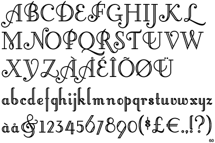
I also like this font called little lord font leroy. (isn't that name hilarious?)
Here's a picture
Image
or you can see it on dafont.com: http://www.dafont.com/little-lord-fontler.font
Instead, he said, Brother! I know your hunger.
To this, the Wolf answered, Lo!

-Elena Passarello, Animals Strike Curious Poses


User avatar
110 Reviews


Gender: Male
Points: 546
Reviews: 110
Thu Jul 03, 2014 5:21 am
Zolen says...


Image

From cool text.com, it's like my handwriting, but slightly better.
Self quoting is the key to sounding wise and all knowing.


User avatar
382 Reviews


Gender: Female
Points: 15691
Reviews: 382
Thu Jul 03, 2014 8:56 am
Dreamy says...


My handwriting! ONLY WHEN I'M WRITING IN AN INK PEN <3
If any person raises his hand to strike down another on the ground of religion, I shall fight him till the last breath of my life, both as the head of the Government and from outside- Jawaharlal Nehru.


User avatar
1735 Reviews

Supporter


Gender: None specified
Points: 91980
Reviews: 1735
Thu Jul 03, 2014 12:53 pm
View Likes
BluesClues says...


I'm actually partial to Times New Roman, but I also like Garamond. And Papyrus is really cool. Freestyle Script reminds me something of my own handwriting, which I like, so I like that one a lot too.


User avatar
20 Reviews


Gender: Female
Points: 171
Reviews: 20
Thu Jul 03, 2014 1:11 pm
Pamplemousse says...


Papyrus! And Lucida Handwriting.
“Admire my gaytime in the mist of purple~” -lostthought, 2015.
~~~~~~~~~~~Usernames~~~~~~~~~~~
Pamplemousse (4/16/14-Now)
Lateritic (8/21/13-4/16/14)
Kittyz101 (3/11/13-8/21/13)


User avatar
401 Reviews


Gender: Female
Points: 1658
Reviews: 401
Thu Jul 03, 2014 1:32 pm
View Likes
ThereseCricket says...


Calibri has always been the default for my documents so I like to stick with it. Besides I have always thought it kinda looked cool!
In Truth Unity,
In Doubt Liberty,
In all things Charity.


Random avatar


Gender: Male
Points: 0
Reviews: 56
Thu Jul 03, 2014 1:41 pm
View Likes
Cole says...


Spoiler! :
Image


In the spoiler above are samples of some of my favorites (from top to bottom):

-FTF Hutan Rantingee
-Bifur
-Anorexia
-Skeetch
-IM FELL DW Pica
-Trajan


User avatar
696 Reviews

Supporter


Gender: Female
Points: 5533
Reviews: 696
Thu Jul 03, 2014 4:44 pm
View Likes
Audy says...


For creative writing, I like Georgia and Cambria :) For something more clean and business, I like Tahoma or Verdana.


User avatar
1272 Reviews


Gender: Other
Points: 89625
Reviews: 1272
Thu Jul 03, 2014 5:36 pm
View Likes
Rosendorn says...


Depends on the project.

Cat Steps and related is Book Antiqua. Nothing else looks right, but I can't use that font for any other project now.

Times New Roman is school stuff because when you hit university professors start having preferred fonts you have to write in and it's a nice way to set up my documents to know "this is school" universally.

Calibri is for various RPs, usually because that's the default font when I copy any sort of chatlogs over.

Other projects tend to get their own fonts once I've been working on them long enough. Haven't hit that point yet on a lot of them.
A writer is a world trapped in a person— Victor Hugo

Ink is blood. Paper is bandages. The wounded press books to their heart to know they're not alone.


User avatar
126 Reviews


Gender: Male
Points: 7577
Reviews: 126
Thu Jul 03, 2014 10:17 pm
View Likes
Vasticity says...


courier yo
And the angel said unto him, “stop hitting yourself, stop hitting yourself.” But lo, he could not stop, for the angel was hitting him with his own hands.


User avatar
131 Reviews


Gender: None specified
Points: 11451
Reviews: 131
Fri Jul 04, 2014 4:58 pm
View Likes
MaryEvans says...


Nyala for fancy stuff, and Georgia for more common writing.


User avatar
73 Reviews


Gender: Male
Points: 1442
Reviews: 73
Fri Jul 04, 2014 5:08 pm
View Likes
Zontafer says...


I usually go with Times New Roman, since it's the default.
Otherwise, I like Georgia. It looks so 'clean'.
"If you're going through hell, keep going."
- Winston Churchill


User avatar
621 Reviews

Supporter


Gender: non-binary
Points: 4984
Reviews: 621
Fri Jul 04, 2014 6:49 pm
View Likes
Rook says...


@MaryEvans I've just been using Nyala for my latest story! :D
Instead, he said, Brother! I know your hunger.
To this, the Wolf answered, Lo!

-Elena Passarello, Animals Strike Curious Poses


If you want something badly, you just gotta believe it's gonna work out.
— Andy, Parks & Rec