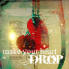
Ah, gotta love Photobucket. Where the clouds are used to be a big huge white blob, so I'm pretty proud of my hand made sky. Heh. The picture below is a picture of Scotland. Also, Bitter is in the clouds because the clouds are 'bitter' and the sky is 'sweet'. (Though the clouds are pretty sweet to me. [self-righteous]) I added a few softening effects and played with the saturation to give it a kind of glow and make the green in the eyes more brilliant. Anyway, I got the pictures from Google... so thanks to the people who I got it from.
Attachments
Bitter Sweet Cover.jpg (142.77 KiB) Viewed 473 times
eviscerate your fragile frame spill it out in ragged form a thousand different versions of yourself.
The wonders of photoshop huh? Well, I think you did a fairly good job on this, I can't put my finger on it but something seems a little off, it might be the placement of the eye but there is something missing in my opinion. Maybe make the clouds a little darker, it would represent bitter a little better. The way you put the photos together though, you wouldn't even notice that they weren't together if you hadn't told us which pictures you used.
Good job! Keep it up!
Porcelain skin stained with tears,
Hands covering her face to hide from her fears.
I like this but I think the eye is in the wrong place. I don't know what your story is about but I do think the eye throws off the beauty of this possibly historic castle in Scotland because the clouds have this painted effect as which clashes wonderfully with the castle but then there's the eye. Great Job all in all though.
True love, in all it’s celestial charm, and
star-crossed ways, only exist in a writer’s
mind, for humans have not yet learned
how to manifest it.
This is a really pretty cover. I only have a couple things to tell you.
1) As everyone else said, the eyes is a bit out of place. It's even a little crooked. I would move it slightly to the right and make it perfectly straight.
2) I like the title, but I think you need to move it down. It's too high up on the page. I would put the "Sweet" word so that it is overlapping the sky AND the city. I like it on the right part of the page, though. It's pretty sweet..
I love the title cover and the book. And I will critique the next four chapters. I promise. XD
This is really nice, I love messing around with Gimp and especially things like this
The houses are a little blurry, and to be honest I don't know if they are needed. I think there's too much going on to focus, so I would recommend letting there be a pale blueness at the bottom. It might be nice to have a little road or whatever. I haven't read your novel but does it fit in with the story?
Not bad, lovely font!
"A man's face is his autobiography. A woman's face is her work of fiction." ~ Oscar Wilde
I know you've shown me this before but now that I look at it better it does look a bit off... Like most people said the eye is kinda out of place. But other than that I think its good!
Hmm... To the left of the eye there seems to be no top lashes, so maybe you could try editing that (copy and paste from the other lashes or try using a soft brush to draw it in yourself).
Also, the city picture seems blurry... that's caused by using GIF (or sometimes JPG if you set the quality low enough) as the file format. I don't think you caused it, must have been from the original image. Anyways, I would try to use a blur/soften tool to make that look better. It may even lessen the action (even though I disagree with Blink, I think it's fine and blue would be boring ).
Be aware that it'll still look great even if you don't edit it. You did a fantastic job.


Gender:
Points: 3214
Reviews: 137