z

Young Writers Society


Jon O.


User avatar
18 Reviews


Gender: None specified
Points: 890
Reviews: 18
Mon Apr 28, 2008 11:31 am
Robin says...


Image
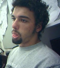
The shading is a little off, I'm not too fond of that. Forehead doesn't look too good in comparison. I think I'll work on the background sometime soon since it doesn't look too realistic. Anndd a few other parts :oops:

Reference pic:


Image
Last edited by Robin on Mon Apr 28, 2008 10:43 pm, edited 1 time in total.


User avatar
270 Reviews


Gender: Female
Points: 890
Reviews: 270
Mon Apr 28, 2008 4:06 pm
blacktiger3915 says...


I love this! The shading is beautiful! Wow! It's a good looking man. Please keep drawing.
Don't send sheep to kill a wolf.


User avatar
694 Reviews


Gender: Female
Points: 3654
Reviews: 694
Mon Apr 28, 2008 9:32 pm
Via says...


This is very good Robin!

The only thing I really have to complain about is his upper lip. His lower lip pops, but his upper lip seems to sink back into his face with the shading, which is weird.

Also, I just noticed, the left side of his face (if you are looking at it, of course) kind of blends in to the background...a bit of a shading difference would do some good here.

I would like to know a little bit more about what the sign behind him says? Or if this is a drawing for a specific motif or something to make the sign evident?


Very nice work!
My Literary and Arts Blog

"I think I'd miss you even if we'd never met." -The Wedding Date


User avatar
2058 Reviews


Gender: Male
Points: 32885
Reviews: 2058
Mon Apr 28, 2008 9:53 pm
Emerson says...


I really love it! I agree with Via that the sign could be done up a bit more, or I would at least like to know more about it. The only thing I can see off (other than what Via mentioned) is that the left side of his face seems too straight. It doesn't seem natural, and so it makes the whole shape of his face seem a little strange. The shading doesn't seem so bad, but I am no artist and I wouldn't know exactly what constitutes as "good" or "bad", haha.

Sorry for writing such a useless blurb of a crit! I hope to see more of your art though--perhaps larger?
“It's necessary to have wished for death in order to know how good it is to live.”
― Alexandre Dumas, The Count of Monte Cristo


User avatar
381 Reviews


Gender: Female
Points: 1144
Reviews: 381
Mon Apr 28, 2008 10:02 pm
Fand says...


Very nice! As Meg points out, his lips are a little weird, and the left side of his face is curiously lacking in shape, but I love the whole concept; his gaze seems so empty, almost resigned, and yet "Free" appears behind his head almost like a thought. Perhaps a commentary on the contradictory nature of freedom and happiness?

Nicely drawn. ^_^
Bitter Charlie :: Shady Grove, CA :: FreeRice (162,000/1,000,000)


User avatar
26 Reviews


Gender: Female
Points: 890
Reviews: 26
Wed Apr 30, 2008 12:58 am
Sacred says...


Thats really well done, I can see they look almost identical. I love the shading job you did as well :D
I just noticed that his eyes seem a bit too big and his forehead is tilted out a little bit too much. But those are just nitpicks.

Good Work ^^
you just keep giving, but you never get back


Random avatar


Gender: Female
Points: 890
Reviews: 57
Wed Apr 30, 2008 4:15 pm
darkdove says...


I like it! you are really talented! keep it up I'd like to see more


User avatar
189 Reviews


Gender: Male
Points: 890
Reviews: 189
Thu May 01, 2008 6:27 pm
[deleted1] says...


Wow, Robin, this is great. I love the details in the face. I also love the shade. Very good work. Keep it up.

-Rick.


User avatar
438 Reviews


Gender: Female
Points: 2999
Reviews: 438
Fri May 02, 2008 1:39 pm
JFW1415 says...


I really liked it! Just watch the lower lip – I thought the tongue was a lip at first. ;P Also, the shelf next to him, and the shading below it, seemed a bit off. I thought you had just ended it too soon, but then I realized it was shading.

I also agree that the left side of his face is too straight. Also, his neck seems to be turning very sharply, yet his head isn’t. Maybe make the line there a bit softer?

*Shrug* Again, I’m no artist. I really liked this; ten million times better than what I could do. ;P

~JFW1415


User avatar
582 Reviews


Gender: Female
Points: 1068
Reviews: 582
Fri May 02, 2008 7:16 pm
KJ says...


This was really good. I think the best thing was the way you made the eyes so realistic. Some things don't exactly match up to the picture - like his ears, for example - but if you're not aiming for it to be identical then it's okay. Great work. Keep drawing.


User avatar
16 Reviews


Gender: Female
Points: 1065
Reviews: 16
Fri May 02, 2008 7:54 pm
A786 says...


Marvelous!!! :o
I like it.

Keep up the good work!
GOOD LUCK :P
"Expect happiness, do not expect miser."
-Dr. Aa'id Al-Qarni

"The hero is the one who goes beyond his ability to improve
his skills, until he becomes able to improve, and perhaps even
alter, the skills of others."
-Enjoy Your Life


User avatar
370 Reviews


Gender: Male
Points: 890
Reviews: 370
Sat May 03, 2008 6:57 pm
Aedomir says...


That really is amazing, honestly you are very talented. I wonder how some people manage to do this type of thing - I am lucky to draw an oval face!

Well done, the shading is spot on.

-Mark
We are all Sociopaths: The Prologue

Sociopath: So • ci • o • path noun
1. Someone who believes their behaviour is right.
2. Human.


User avatar
83 Reviews


Gender: Female
Points: 1090
Reviews: 83
Tue Jun 10, 2008 8:03 pm
Raimunda says...


SCHIZZ!!! This is brilliant. I kinda like how it doesn't look exactly like you. but you've sort of developed your own style. And I love the piece of paper saying 'free' behind your head. Yeah, so, ME WANT MORE!!
I just hit my computer
Because it was being slow
I need my daily Smallville fix
And it will not load the video.


Reading is one form of escape. Running for your life is another.
— Lemony Snicket