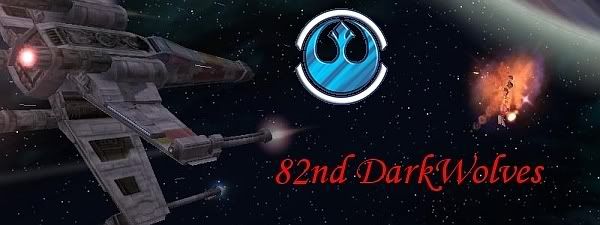
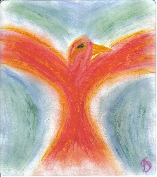
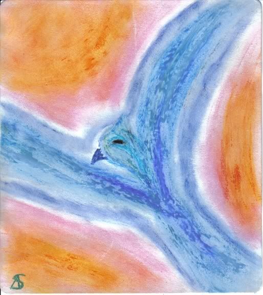
the first one's awesome, but a little too dark blue.
The animations are awesome, but let the smiley stay a little bit at the bottom so you can see the ! with it. And make the bouncy ball more exciting, or make it go higher.
The first and the last are my favorites of this next batch. The blue symbol in the first is really cool and stands out well against the background. Also, that ship is awesome. Some really in-depth detail there so nice job.
I like the last because the white text is cool and the colouring is really good. It's a touch blurry though.
The ship is really detailed, it looks very good, and I like the explosion too.
That bouncy ball of dead is after my soul... the only problem I have with it is that the flashing text makes my eyes sting a little, but they're quite strange like that.
It's an executioner from SO3 *dances and skips off to play with Albel*
please grant me my small wish; (love me to the marrow of my bones)
A note, The original image with the ship is a screenshot from a game called Star wars Galaxies. My friend needed some some stuff for his site and i used some of their screens as backdrops. The blue emblme as well was done by someone else. (I'm not that good yet.)
And here be another animation:
"Maybe Senpai ate Yuka-tan's last bon-bon?" ----Stupei, Ace Defective
The two oil pastels have such great use of colour! And the doodles are fun to look at. The one I really like though is the last. That is one awesome background. In fact, if I was a member of the CCF I would so use it!
Gender:
Points: 1373
Reviews: 270