It's not supposed to be read, but it's an exerpt from a short story I wrote
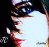
This, if you noticed, is my new icon =D
My boredom hath no limits =D
-JC
But that is not the question. Why we are here, that is the question. And we are blessed in this, that we happen to know the answer. Yes, in this immense confusion one thing alone is clear. We are waiting for Godot to come. -Beckett
I'm trying to get photoshop from my neighbor at the moment...slow progress, hehe.
I love your new avatar, by the way =D
-JC
But that is not the question. Why we are here, that is the question. And we are blessed in this, that we happen to know the answer. Yes, in this immense confusion one thing alone is clear. We are waiting for Godot to come. -Beckett
The top one bores me. I don't like how much contrast there is between the words and the picture: if it's not supposed to be read, make it less readable! Maybe make the font smaller, darker, italicized, or all three.
I like your new icon. I think it would be cool in an a-cemetrical way if the JC and obsessed were together on her cheek, but it's great as it is.
Jennafina's Love Your Body Already Dammit Campaign
I like the first one though you need to make the 'Enough to live' easier to read (if that is ment to be read) or get rid of it. How it is at the moment the text just seems out of place.
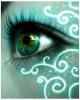
I really like the second. The colours are fantastic and i like the font of the text. Very good!
I agree that the 'Enough to live' should either stand out more or cease to exist but the background is nice.
As for the second one, I was admiring it earlier. I love the boldness of the red and the blue against the rest of the face and it's simply enchanting. The contrast and lighting are perfect.
The simple truth is that authors like making people squirm. If this weren't the case, all novels would be filled completely with cute bunnies having birthday parties. — Brandon Sanderson, Alcatraz Versus the Evil Librarians


Gender:
Points: 890
Reviews: 514