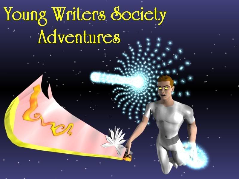
Ha, on the note of levity, I love the arbitrary dash of different weapons and electricities in the thing. Still, the colours are a little garish - clash, don't they? Then again, it may merely be an impish aversion to pink. ^_^
IMP
ex umbris et imaginibus in veritatem
"There is adventure in simply being among those we love, and among the things we love -- and beauty, too."
Ah, it's pretty good. The shoulders are a little too broadish for my liking, and maybe through in a spiraling piece of paper or something? Pretty sweet, though.
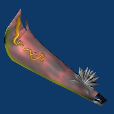
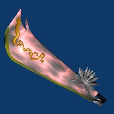
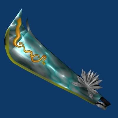
That is due to lighting. It's red. It's supposed to be enrgy fluctuations on the sword but that obviously didn't land. Here are three versions of the sword: 1. reduced lighting effect. 2. same sword in pic 3. red effect removed all together.
1.)
2.)
3.)
"Maybe Senpai ate Yuka-tan's last bon-bon?" ----Stupei, Ace Defective
I like the first one, it looks pretty red compared to the others. Also, out of curiousity, is that guy supposed to be you? Since that's your sword, isn't it? Oh, when do you make me?!?! *concieted moment...there goes my ego* *Smacks self* Ok, i'm better now.
are you asking for our opinions on the lighting between the two nwe ones? Because the second is waaaay better
The good parts of a book may be only something a writer is lucky enough to overhear or it may be the wreck of his whole damn life — and one is as good as the other.
Ernest Hemingway
Adam that is sooo much better, there is no color confusion, its supposed to be purple right? (ha ha i'm evil) Anyways its so much better. But the dude's eyes look creepy.


Gender:
Points: 9022
Reviews: 647