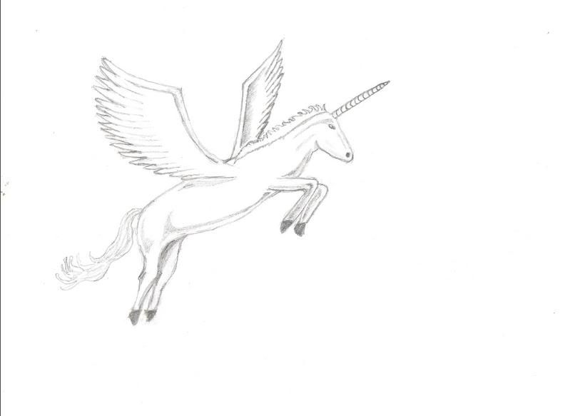
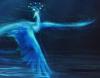
The mane is WAY too short, and it isn't flowing naturally with the wind. it seems as if its been dyed/straighted/fried WAY too many times, and considering that only "My Little Pony's" have those specific hair stuffs, it seems REALLY out of place to have that many problems with the mane.
The head looks like it came from a snake. No offense, but it really does. Horses have VERY definate shapes to their heads, many of which are extremely defined and appear on ALL horses. For example, Horses have a circular cheek that invisibly leads into the ear and strictly changes into the jaw/teeth at either point. The top of the head is way too straight, and it doesn't have a mouth. The nostrils are also a tad bit too big. The horn is also too big for the unicorn's head to carry.
Its back is broken, and there appear to be no muscles/ tissue/ anything that ISN'T bone on the horse.
Its legs are also broken, as well as way too short for their own good.
Why is it that the body and the head aren't facing the same direction?
I like the tail, its uber cool!
The hooves aren't all the same shape/size. They also lack certain qualities that the hooves of horses have.
Why does it have snake eyes?
The wings are actually pretty good, but they're not flapping/ holding the unicorn in the air. Actually, right now they look like they're just they're for show.
You sort of threw in random shading in places where there shouldn't be. Focus more on pictures of actual horses, and notice the way that light reflects off of their body, as well as where shadows actually lie.
You may possibly want to give it a background, or at least add more detail to it to make it a bit more eye catching.
Overall, its not bad. All it really needs is some improvments and it could have the potential to be uber cool!
If you color it, make its mane/tail rainbow
I feel the dire need to go buy tootsie rolls right now, and I can't really explain why.
i like it, its cool. I dont think it has a snake face...and the head and body are facing the same way lol. keep it up x
"Sometimes we see a cloud that's dragonish,
A vapour sometimes like a bear or lion,
A towered citadel, a pendant rock,
A forked mountain, or blue promontory,
With trees upon't that nod unto the world,And mock our eyes with air.."
I think both the horse an wing parts need improvement. That being said, horses and feathered wings are amongst the hardest things to draw, so don't feel discourages. (I also think the horn is a little too long, considering the size of the rest of it.)
I'd recommend drawing from a photograph of a horse, and then look at some feathered wings (or, better yet, tutorials on how to draw feathered wings).
It's a little bit too elongated in the middle, and that's what makes it look a little weird. And it needs a slightly longer neck and more slender features, since unicorns are very graceful...
STILL! UNICORN!
Ubi caritas est vera, Deus ibi est.
"The mark of your ignorance is the depth of your belief in injustice and tragedy. What the caterpillar calls the end of the world, the Master calls the butterfly." ~ Richard Bach
I loves it! I personally think it's great as is but I'm not much for the whole "make everything look real!"dealy. Cause what is the point of art if everything has to be all perfect and trash. Anyway, I think it needs a background.
If you do want it to be all perfect then i suggest the gridding method. It's how welearned it in school. Get a picture and some transparent cover the picture and graph it into equal squares and then graph your paper lightly so you can earase it later. Then just draw each square.
One squae at a time is less daunting then an whole horse. Hope that made sense.
"Maybe Senpai ate Yuka-tan's last bon-bon?" ----Stupei, Ace Defective
I would have prefered a little more muscle definition: let us know what's going on under that velvet hide! It would also give the unicorn a more definite sense of being there, of having three dimensions. Much better than I could have ever done, though.
"In a sort of ghastly simplicity we remove the organ and demand the function...We laugh at honour and are shocked to find traitors in our midst. We castrate and bid the geldings be fruitful." ~C.S. Lewis
But, other than that, it's a ....nice...drawing. But, it's not spectacular. It's a tad boring. Add some details maybe? A little background may even spruce it up since unicorns are like....white haha.


Gender:
Points: 22481
Reviews: 558