Fix up the shading -- it doesn't need it, but what you have is out of place.
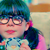
Anatomy--this is all pretty picky, so I was sort of dubious as to whether or not I should post it, but you wanted me to.
The space between the neck and right shoulder isn't large enough. The right forearm should be wider; since the forearm is pressed against the upper arm the fat/muscle there flattens out.
The shape of the left arm is wrong; it should widen at the beginning elbow and have a smooth curve down to the wrist.
Collar bones should be more horizontal.
As for inking, make sure you tidy it up a bit and darken the lines you want inked--makes things easier.
Otherwise, it's pretty good. Apart from the few little flaws I noted the anatomy is overall good. The face is done well, simple but fairly well proportioned and it just comes off well.
I really like this! Her hand behind her head looks sort of like the fingers just disappeared, though. Lighten up the picture, it doesn't need that shading. I'd like to see the whole body.
She has an extremely weak chin, and her nose is virtually non-existant (It sort of reminds me of voldemorts.... just two slits and a slight rise leading to them) The ears are too low, and they're not exactly attached the the jaw. Also, the top of her head is too small. Its like a part of it has been crushed it. Just give it some more mass. Also, the neck should be symetrical to the face (same on both sides) This one seems as if its larger on one side than another, almost like the head was popped off and put back on at an angle. The shoulders, like the neck, are not symetrical to the head, and even less symtetrical to the neck. I like the outfit (AND YOU GOT THE BOOBS RIGHT! Actually, I'm pretty proud about that one. Most people tend to screw them up) but her hips are WAY too skinny. All they really need is to be a bit wider. The arms are exceptionally cool, and very uber perportionate. Her left hand, though, completely disappears. Considering how thin her hair is and the placement of the hand (and, honestly, the over all feeling of the peice) You should be able to see all of the fingers. Her jaw bone is way too low. WAIT- Her right boob is bigger than her right boob..... you should probably fix that. The way you draped the jewelry is amazing, truely beautiful.
Anyway, thats my critique. Its a cool picture, and its definately got a lot of potential. You just need to fix some of those bigger perportion mistakes.
EDIT: SORRY! I reread over it, and found a few mistakes. The one that needs to be fixed the most, though, was this:
Her right boob is bigger than her right boob.
What I meant was:
Her right boob is bigger than her left boob.
Last edited by stirly on Sat Jun 09, 2007 1:10 pm, edited 1 time in total.
I feel the dire need to go buy tootsie rolls right now, and I can't really explain why.
I think you need to fix the shading on her cheeks.
I would have likes to see teh whoel body.
Well done!
"A good plot is like a dream.If you dont write down your dream on paper the moment you wake up,the chances are you'll forget it and it'll be gone forever"-Roald Dalh.
Lancrist--- Great tips! I'll do my best to fix it. Yeah, her right shoulder's terrible. xD
CK-- When I ink it, I was going to make her hair really dark, that's why I didn't show her fingers. I'm not sure, though.
Stirly-- Thanks so much for the in-depth critique! Some of it didn't make sense, though. Lol, she does have a voldemort nose! When I make noses more defined, though, they look really big and less delicate.
Sohini-- Thanks. I think the Becky faces are better, but I'm glad you think it's my best! She's not a character yet...
ANI-- I fixed the shading! It looks better now. I can't show her whole body, though. I don't have enough room on the page.
Jennafina's Love Your Body Already Dammit Campaign
Mmm I feel like the shading could be blended a little more. Also, I tend to be a fan of BOLDNESS, but that's kind of a personality thing haha. The right arm is a little odd from beginning to end, including the things wrapped around it.
But, other than that, I think it's pretty good. I think it might serve better as a first draft kind of, with room to grow?
Lovely, Jenna! Her shading's a little off, and the anatomy's a bit quirky, but your style doesn't seem to pay as much attention to realism--which, given your general subjects, works quite well. ^_^ I love how she's playing with her hair.
In addition to those things mentioned above, I'd like to see more detail in her shirt, when you go to make this final (and I do expect you to, or else)--right now it looks like she's wearing nothing and she has no nipples O.O Just add more thickness to the lines of the clothing when you ink it, and it'll be fine.
Her shoulders might be a TAD unbalanced, but you can easily get away with it by just saying that her shoulder is leaned backward to play with her hair.
I see nothing wrong with her nose
Her eyes may be slanted a little much, but hey, she's an elf, right?
Well done.
Got YWS? I do.
Lumi: Don't you drag my donobby into this. Lumi: He's the sweetest angel this side of hades.
Yeah, it may be me, but it seems your arms are out of porportion. They're too narrow/long, maybe both. And it may be just the way I'm viewing it, but the face just doesn't seem right. It may be the fact you used somewhat cartoon-styled eyes or the fact you can barely tell there's a nose.
Aside from that, though, it's very nice. The hair is thick and seems to have volume. Thumbs up. The shading is wonderful, but you could use a little bit more. On the right arm (hanging by her side) and a little more under the chin and hair against her face.
Bravo.
"Neglect not the gift that is in thee, which was given thee by prophecy, with the laying on of the hands of the presbytery." Timothy 4:14 KJV


Gender:
Points: 6523
Reviews: 657